Action priority matrix from your impact and effort scores.
Plot a list of possible actions by impact and effort, using the scores your team agreed, to see quick wins, major projects, fill-ins and thankless tasks.
One quadrant chart with effort across and impact up, each action placed from your own scores. Quadrants carry the standard names or your own. The reply lists anything unplaced or sitting on a dividing line. Check each point against your scores.
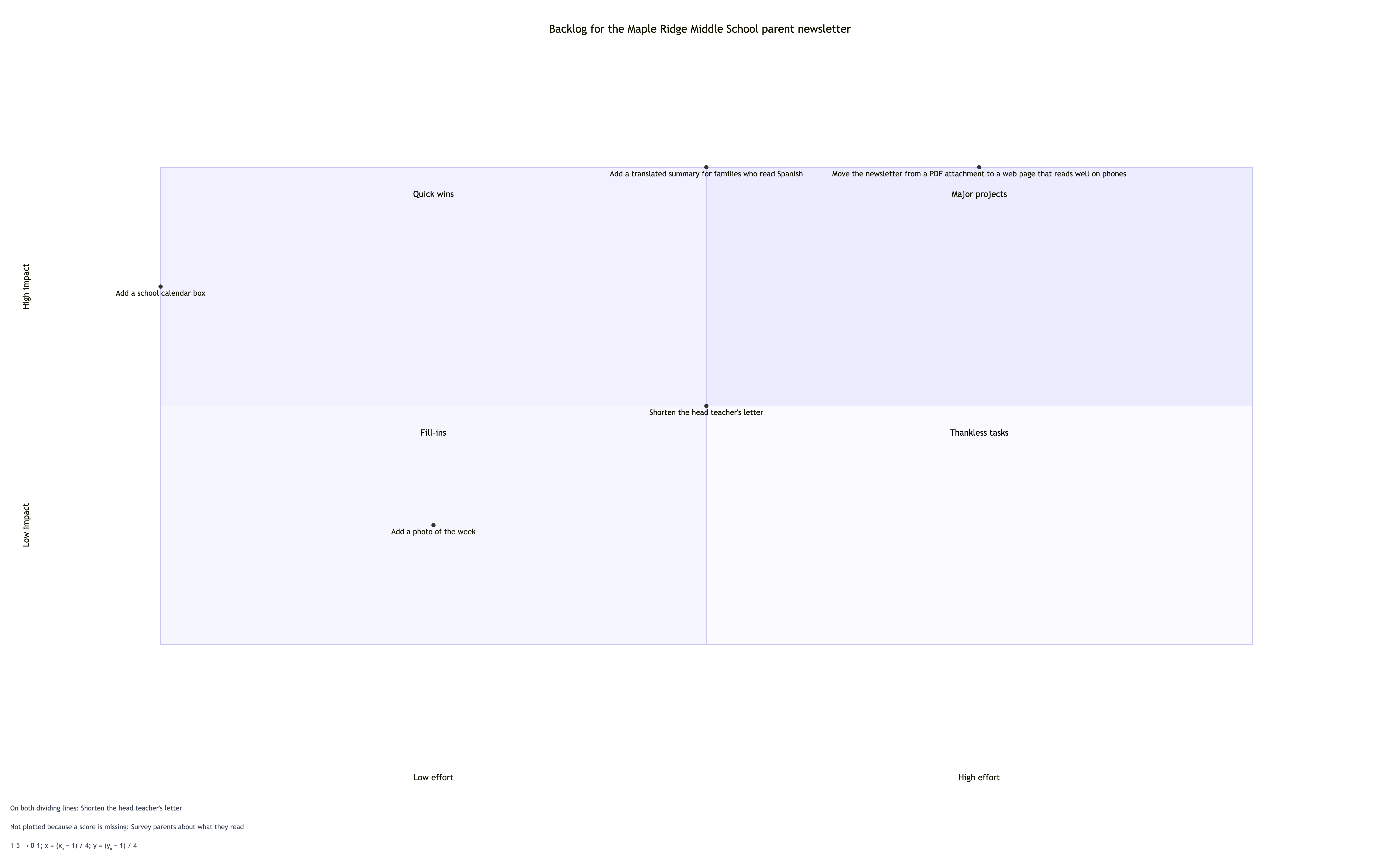
Missing effort score, a midpoint tie and a long action name on a 1-5 scale
What you are prioritizing
Backlog for the Maple Ridge Middle School parent newsletter
Actions as action | impact | effort
Move the newsletter from a PDF attachment to a web page that reads well on phones | 5 | 4
Add a translated summary for families who read Spanish | 5 | 3
Add a school calendar box | 4 | 1
Add a photo of the week | 2 | 2
Shorten the head teacher's letter | 3 | 3
Survey parents about what they read | 3 | ?
Scoring scale
1 to 5 for both; 5 is highest impact or most effort
How the scores were agreed
Left empty
Quadrant names, top left to bottom right
Left empty
The survey action has no effort score, so it is left off and named. Checks that the 3 and 3 action sits on both dividing lines and is reported, the long name stays whole, and the standard quadrant names apply.
Same task, three directions
Pick a direction to start from.
01
Classic quick wins matrix
The standard four names, with effort left to right and impact bottom to top, for a planning meeting where the terms are already familiar.
02
Your own quadrant labels
Plain labels your team already uses, such as Do now or Drop, on the same impact and effort axes.
03
Value and cost axes
The same two-by-two with axes renamed to fit the discussion, such as customer value and cost, while keeping your scores.
What the template keeps
The parts that stay consistent.
01
Axis direction
Effort increases to the right and impact increases upward, so quick wins always sit top left.
02
Your scores
Points are placed from your numbers only. Nothing is nudged to look tidier.
03
Unscored actions stay visible
Anything missing a score is named in the reply rather than placed by guesswork.
How to use it
From details to a result.
01
Name the goal
What the actions are meant to improve. It becomes the chart title.
02
Score each action
One line per action with an impact score and an effort score on the same scale. Leave a question mark if a score is not agreed.
03
State the scale and the source
Say what the lowest and highest numbers mean, and how the scores were decided.
04
Review in Vizify, then check the quadrants
Nothing runs until you send. Compare the list of actions per quadrant in the reply with your expectations.
Output boundaries
What to check before you use it.
Vizify does not estimate impact or effort. Positions are only as good as the scores your team agrees.
Scores are rescaled to fit the chart. An action at the exact middle of the scale sits on a dividing line.
Labels on points that are close together can overlap. Around fifteen actions per chart stays readable.
This is a quadrant chart, not an illustrated infographic. Layout is automatic and export options are whatever the Vizify App offers.
QuestionsWhich quadrant are the quick wins in?+
Top left. Effort runs from low on the left to high on the right, and impact runs from low at the bottom to high at the top, so high impact with low effort lands top left.
Can I use this as a 4 quadrant infographic in a report?+
It produces a clean quadrant chart rather than an illustrated infographic. It works well in reports and slides where readers need to see where each action sits.
What if our team has not scored one action yet?+
Put a question mark in place of the score. The action is left off the chart and named in the reply, so the gap is visible until you agree a number.
Do I have to score from 1 to 10?+
No. Any scale works if you state it, such as 1 to 5 or low, medium and high written as 1, 2 and 3. Use the same scale for impact and effort.