User flow chart for one task in your app or website.
Map the screens and actions a user goes through to finish one task, including sign-in checks, error states and back paths, with every branch ending somewhere.
One flowchart of a single user task, from the entry point through your screens, actions and conditions to each success or exit point. Screens and system checks are drawn differently. Check every branch, back path and error state against your design.
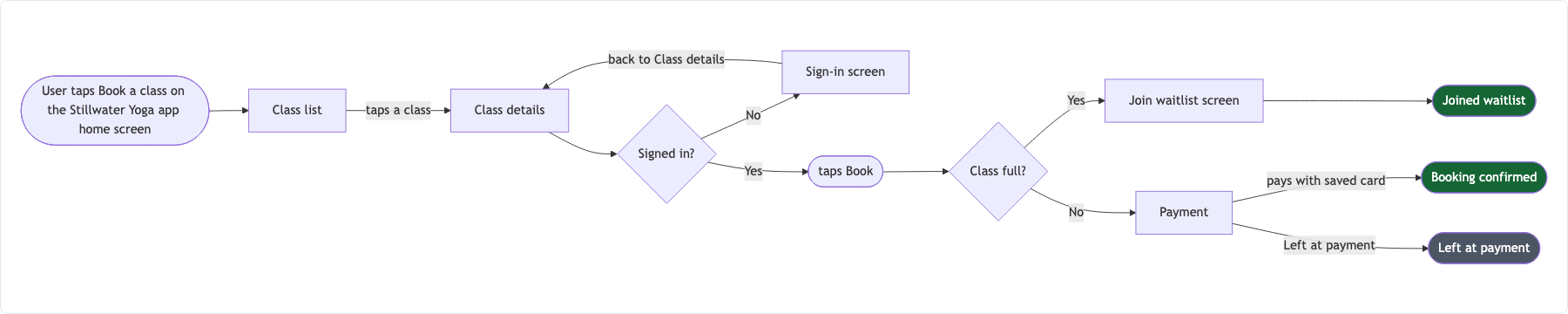
Yoga class booking with a sign-in check and a waitlist branch
Entry point
User taps Book a class on the Stillwater Yoga app home screen
Screens and actions in order
Screen - Class list
Action - taps a class
Screen - Class details
Action - taps Book
Screen - Payment
Action - pays with saved card
Screen - Booking confirmed
Conditions and where each answer goes
Signed in? No → Sign-in screen, then back to Class details. Yes → Book
Class full? Yes → Join waitlist screen. No → Payment
Success and exit points
Booking confirmed; Joined waitlist; Left at payment
Notation or emphasis
Success end in green, abandon and error ends in gray
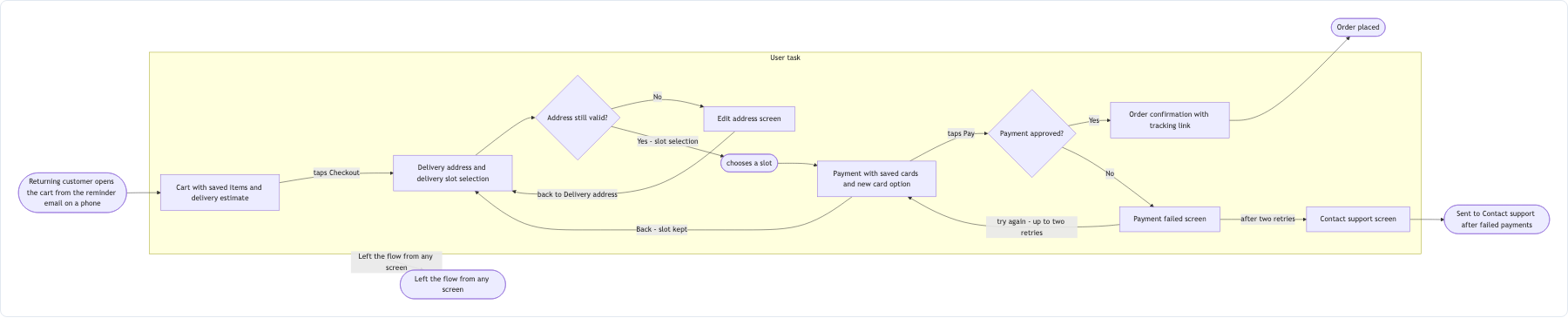
Checkout with a payment retry limit, a back path and long screen names
Entry point
Returning customer opens the cart from the reminder email on a phone
Screens and actions in order
Screen - Cart with saved items and delivery estimate
Action - taps Checkout
Screen - Delivery address and delivery slot selection
Action - chooses a slot
Screen - Payment with saved cards and new card option
Action - taps Pay
Screen - Order confirmation with tracking link
Conditions and where each answer goes
Address still valid? No → Edit address screen, then back to Delivery address. Yes → slot selection
Payment approved? Yes → Order confirmation. No → Payment failed screen, try again (up to two retries, then Contact support screen)
User taps Back on Payment → returns to Delivery address with slot kept
Success and exit points
Order placed; Sent to Contact support after failed payments; Left the flow from any screen
Notation or emphasis
Left empty
Checks that the retry loop stops after two attempts and exits to Contact support, that the back path returns to the right screen, and that long screen names are kept whole.
Same task, three directions
Pick a direction to start from.
01
Happy path first
The main success route drawn in a straight line, with every alternative branching off it, for a quick review with stakeholders.
02
Error and edge states
The same task with every failure, retry and dead end made visible, for QA planning or a design review.
03
New versus returning users
Two entry routes that join at a shared screen, for tasks where sign-up and sign-in split before the core flow.
What the template keeps
The parts that stay consistent.
01
Screens and actions kept apart
Screens are boxes and actions label the moves between them, so the chart reads like a walkthrough.
02
Every branch has an exit
Each path ends at a listed exit or returns to an earlier screen with a label saying why.
03
Your screen names
Names match the ones you use in design files and tickets.
How to use it
From details to a result.
01
Pick one task and its entry point
Book a class, reset a password, check out. One task per chart keeps it readable.
02
List screens and actions in order
Start each line with Screen or Action so the chart can tell places from things the user does.
03
Add the conditions
Write each check as a question and say where each answer goes, including back and retry paths.
04
Name every exit, then review in Vizify
Success, abandon and error ends. Nothing runs until you send the brief.
05
Check each branch against your design
Follow every path to an exit and confirm screen names match your wireframes.
Output boundaries
What to check before you use it.
The chart shows the flow, not the screens themselves. Wireframes, UI copy and layouts are not drawn.
Vizify does not test your app or find missing edge cases. It flags branches without a destination, not paths you did not mention.
One task per chart. Several tasks in one diagram quickly become hard to follow.
Layout is automatic. Export options are whatever the Vizify App offers for the diagram.
QuestionsWhat is the difference between a user flow chart and a wireframe?+
A user flow chart shows the order of screens and decisions for a task. A wireframe shows what one screen looks like. Use the flow to agree the path before designing the screens.
How do I show that a user can go back?+
Add a line such as "User taps Back on Payment → returns to Delivery address". It becomes a labeled arrow pointing to the earlier screen.
Can this user flow template cover a website as well as an app?+
Yes. Screens can be pages, modals or steps in a form. Use the names your team already uses so the chart matches your tickets.
What if I am not sure what happens after an error?+
Leave the question in the brief. Vizify asks where the branch should go rather than inventing an error screen, which makes the gap easy to raise with your team.