Competitive analysis grid or positioning map from your own findings.
Turn your notes on competitors into a comparison grid or a two-axis positioning chart. You supply the rivals, criteria and evidence; nothing is researched or scored for you.
One chart built from your findings. Many criteria become a comparison grid with one row per option; two axes become a quadrant positioning chart. Values, names and units come only from what you paste. Check every cell or point against your notes, and any rescaling the reply mentions.
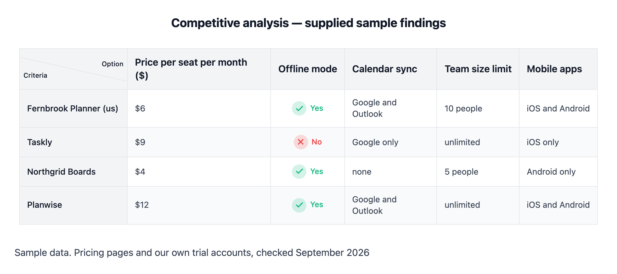
Price per seat per month, Offline mode, Calendar sync, Team size limit, Mobile apps
Your findings for each option
Fernbrook Planner (us) - $6, yes, Google and Outlook, 10 people, iOS and Android
Taskly - $9, no, Google only, unlimited, iOS only
Northgrid Boards - $4, yes, none, 5 people, Android only
Planwise - $12, yes, Google and Outlook, unlimited, iOS and Android
Where the findings come from
Sample data. Pricing pages and our own trial accounts, checked September 2026
What the chart should help decide
Where we sit on price and features before the Q4 pricing review
Two-axis positioning map with a long name and one untested option
Your product and competitors
Fernbrook Planner (us)
Taskly
Brightwater Enterprise Scheduling Suite for Clinics
Planwise
Listline
Criteria or two axes
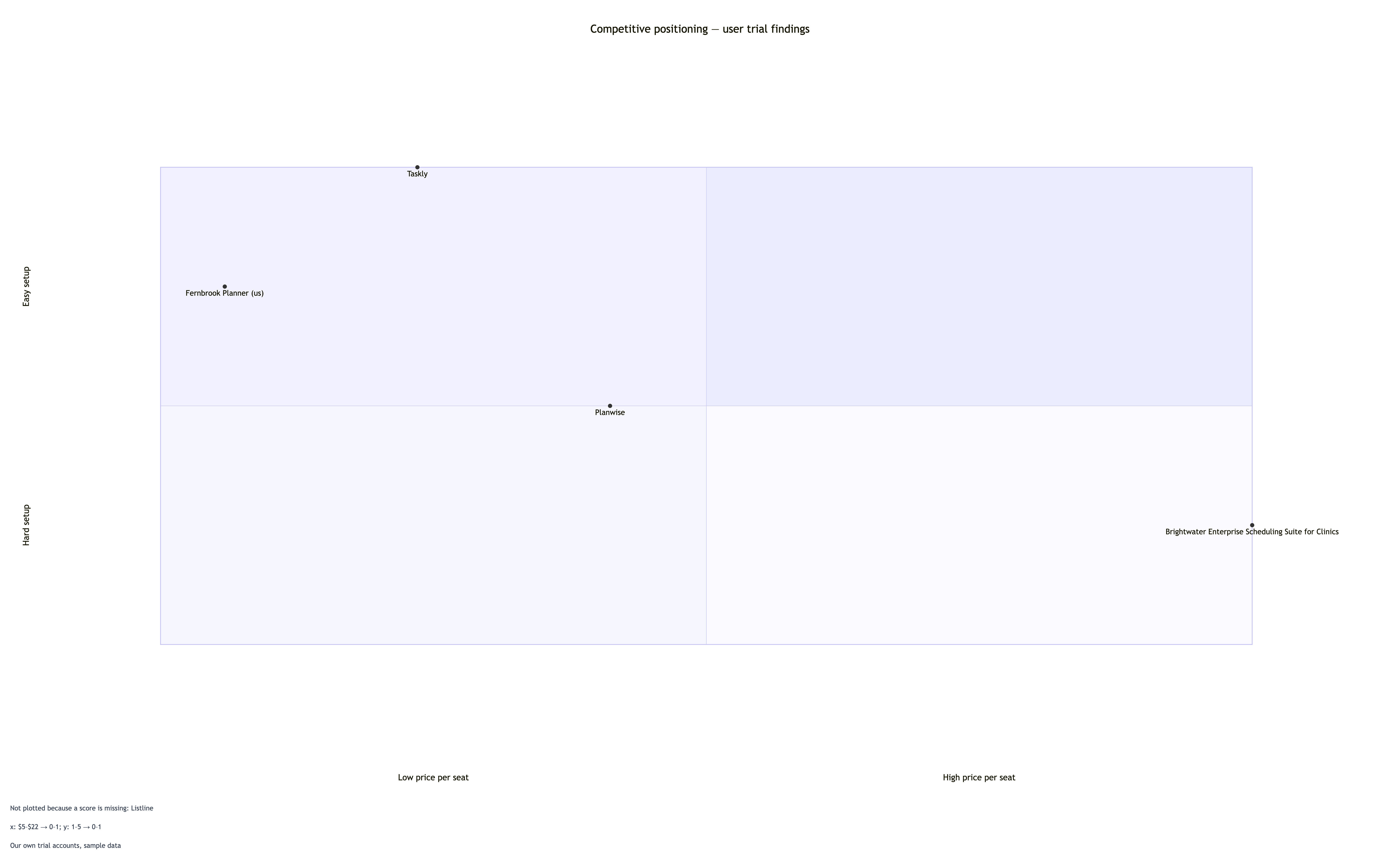
X axis is price per seat, low to high. Y axis is ease of setup from our trials, 1 (hard) to 5 (easy)
Your findings for each option
Fernbrook Planner (us) - $6, 4
Taskly - $9, 5
Brightwater Enterprise Scheduling Suite for Clinics - $22, 2
Planwise - $12, 3
Listline - $5, not tested yet
Where the findings come from
Our own trial accounts, sample data
What the chart should help decide
Left empty
Two axes should route to a quadrant chart. Checks that the long name stays whole, prices and 1-5 ratings are rescaled as stated, and Listline is left off and named rather than given a guessed rating.
Same task, three directions
Pick a direction to start from.
01
Feature grid with ticks and crosses
Competitors as rows and features as columns, with yes/no cells shown as ticks and crosses. Suits an internal review or a sales team's reference sheet.
02
Price versus capability positioning map
Every option plotted on two axes you define, for a quick read of where the market is crowded and where there is space.
03
Numeric competitive metrics side by side
Numbers only, one column per metric with its unit in the header, for comparing measured values such as price, limits or response times you collected.
What the template keeps
The parts that stay consistent.
01
Your values, as written
Prices, limits and ratings keep your wording and units. Nothing is rounded into a new score.
02
Your order
Options and criteria appear in the order you listed them, so your own product stays where you put it.
03
Gaps stay visible
A value you did not supply is shown as not supplied instead of being filled in.
How to use it
From details to a result.
01
List what you are comparing
Put your own product first if you want it in the chart, then two to five competitors, one per line.
02
Choose criteria or two axes
Several criteria give you a grid. Exactly two measures with a direction give you a positioning map.
03
Paste your findings and their source
One line per option, values in the same order as the criteria. Write "not known" where you have no value.
04
Review in Vizify, then check each value
The brief opens for review and nothing runs until you send it. Compare every cell or point with your notes before sharing.
Output boundaries
What to check before you use it.
Vizify does not research competitors, look up prices or rate features. Every value in the chart comes from what you paste.
A quadrant chart plots positions from 0 to 1, so your scores are rescaled. Small differences can look larger once plotted.
A grid stays readable with about six options and eight criteria. Split larger comparisons into two charts.
Row heights, column widths and point placement are automatic. Export options are whatever the Vizify App offers for the chart.
No overall winner, ranking or weighted total is added unless you supply the weights and ask for one.
QuestionsShould my competitive analysis be a grid or a quadrant chart?+
Use a grid, sometimes called a competitor analysis table, when you compare several features or metrics. Use a quadrant when two measures tell the story, such as price and ease of setup, which gives a competitive landscape chart.
Will Vizify find competitor prices or features for me?+
No. This template only arranges findings you already have. Paste the values from your own research and note where they came from so readers can judge them.
What happens if I do not know one competitor's value?+
Write "not known" for that value. The grid shows it as not supplied, and a positioning map leaves that option off and says so, rather than guessing where it belongs.
Can I paste rows from a spreadsheet into this competitor matrix template?+
Yes. Copy the cells and paste them into the findings field, one option per line. Check that the values follow the same order as your criteria before you continue.
Can the chart show which option is best?+
Only if you say how to judge it. Give weights for each criterion and ask for a total, and the reply explains the calculation. Without that, the competitor analysis graph stays neutral.