One generated educational image with your topic as the title, three to five of your approved facts as illustrated panels, and your source and date as a footnote. No climate data is added. Check every fact, figure and the source line before sharing.
Four approved greenhouse effect facts for a Grade 7 class
Approved topic or title
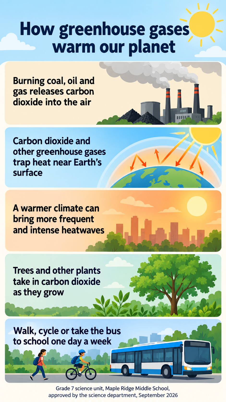
How greenhouse gases warm our planet
Approved facts, one per line
Burning coal, oil and gas releases carbon dioxide into the air
Carbon dioxide and other greenhouse gases trap heat near Earth's surface
A warmer climate can bring more frequent and intense heatwaves
Trees and other plants take in carbon dioxide as they grow
Source and date
Grade 7 science unit, Maple Ridge Middle School, approved by the science department, September 2026
Closing call to action (optional)
Walk, cycle or take the bus to school one day a week
Local beach clean-up figures with a long source and no call to action
Approved topic or title
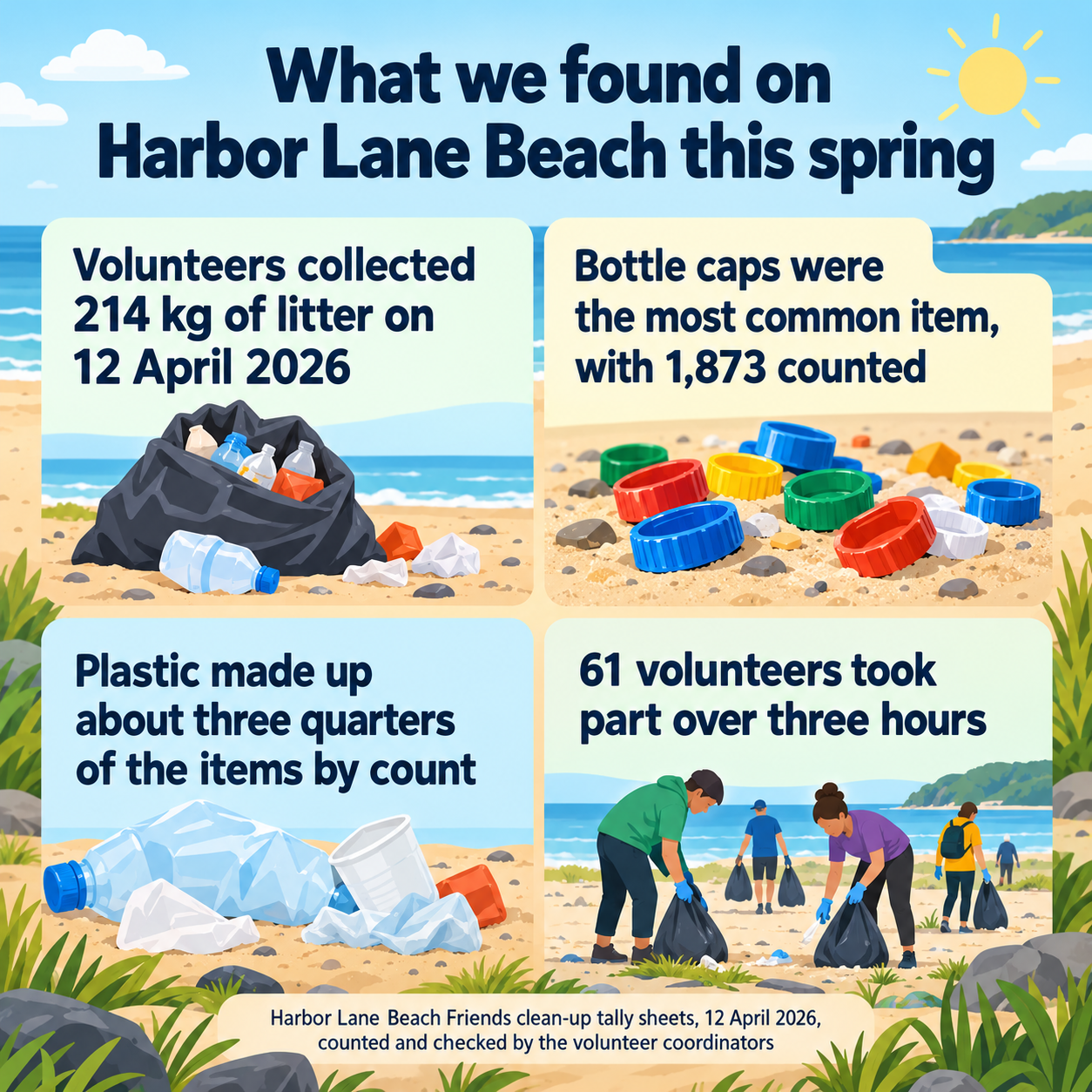
What we found on Harbor Lane Beach this spring
Approved facts, one per line
Volunteers collected 214 kg of litter on 12 April 2026
Bottle caps were the most common item, with 1,873 counted
Plastic made up about three quarters of the items by count
61 volunteers took part over three hours
Source and date
Harbor Lane Beach Friends clean-up tally sheets, 12 April 2026, counted and checked by the volunteer coordinators
Closing call to action (optional)
Left empty
A local environmental infographic with counts, dates and a long source citation, and no call to action. Checks every count and date is copied exactly, the footnote fits, and no global statistics are added to fill space.
Same task, three directions
Pick a direction to start from.
01
Cause and effect chain
Facts run top to bottom with arrows between them, which suits explanations of how one thing leads to another.
02
One illustrated scene
A single landscape with sky, town and forest, and each fact pinned to the part of the scene it describes.
03
Square awareness post
A compact layout for a school club or community group account, with the call to action in a band at the bottom.
What the template keeps
The parts that stay consistent.
01
Your facts as written
Each panel carries one of your facts in your wording, never a paraphrase that shifts the meaning.
02
Source always shown
The footnote stays on the image so the facts can be traced.
03
Calm, factual tone
Illustrations explain rather than alarm, which suits classrooms and community notices.
How to use it
From details to a result.
01
Set the approved topic
Use the title your teacher, school or organization has agreed. It heads the image.
02
Copy facts from your source
One fact per line, worded as your source words it. Keep each to a single sentence.
03
Add the source and date
Name where the facts come from and when, so readers and teachers can check them.
04
Review, generate and check with your source
Your details open in Vizify first. After generating, check every fact and figure against the source before sharing.
Output boundaries
What to check before you use it.
The template does not research climate science or supply data. Every fact and number comes from your approved source.
Figures, years and units are drawn by an image model and can change. Check each against the source before printing or posting.
Illustrations are explanatory, not scientific diagrams or maps. Do not read scale or quantities from them.
Temperature or emissions trends over time need a chart built from the data; Vizify's chart tools are the right place for that.
Three to five facts per image. A longer lesson needs several images.
QuestionsCan Vizify fill in the latest global warming figures for me?+
No. The template uses only the facts you supply and adds no climate data. Take figures from a source your teacher or organization accepts and include it in the source field.
What counts as an approved source for a school project?+
Whatever your teacher or organization accepts, often a textbook, a national science agency or an official report. Give its name and date so the footnote is useful.
Can I make an environmental infographic about a local issue?+
Yes. A beach clean-up, a recycling drive or a school energy audit all work, as long as the counts and dates come from your own records.
Will the illustrations show real data?+
No. They illustrate the idea behind each fact. Numbers appear only as text you supplied, and trends over time belong in a chart.