Topic and audience
Key data or facts
Narrative order
Brand direction
Turn your facts, steps or milestones into one infographic image with a clear reading order. You supply the numbers; check every figure before you publish.
Your brief and choices open in Vizify for review. Nothing runs until you send it.
Topic and audience
Key data or facts
Narrative order
Brand direction
AI Infographic Maker · One generated image to review
Turn your facts, steps or milestones into one infographic image with a clear reading order. You supply the numbers; check every figure before you publish.
Statistics, processes, timelines, or comparisons are organized into sections with a deliberate reading order and visual hierarchy.
The complete brief opens in Vizify, where you can generate, review, revise, and save the work without rebuilding the prompt.

Turn your name, interests and a few highlights into a one-page all about me infographic for a new team, a class or a club profile.

Map the stages of a role and the skills each one builds into a single career path infographic for a team wiki, a mentoring session or a careers page.

Turn three to five communication or active listening tips, the situation they are for and short example phrases into one clear infographic for a team or class.

Present a one-sentence company overview and three to five verified facts as a single fact sheet image, with the source and as-of date you supply.
Start with the message, audience, required content, destination, and any brand or style direction you already know. Rough notes are fine.
Prepare the request in your browser without installing an app. Generation runs in Vizify after sign-in, uses credits, and starts only after you review and send the request.
One generated image to review. Choose a destination to guide the composition, then check the actual image size. Exact pixels, crop marks, bleed and CMYK are not guaranteed; resize or prepare the file before publishing or printing.
Save the image and keep the prompt for a later request. You can revise both in the conversation; saving a reusable workflow is not available.
No. A chart maker plots one dataset precisely with Mermaid or MakeCharts. This AI infographic generator composes a narrative visual — statistics, process, or timeline — as one generated image, so treat exact numeric plotting as approximate rather than chart-accurate.
The brief preserves your facts and reading order, but generated typography and layout aren't guaranteed pixel-exact. Review numbers and labels before publishing, or use a dedicated chart maker when you need exactly plotted data.
A single visual that explains one topic by combining short text, numbers, icons and a clear reading order, such as a process, a timeline or a set of statistics. It is meant to be understood in one pass.
Pick one message, list the facts or steps in the order a reader should see them, choose a structure and format, and add your colors. Preparing this here is free; after sign-in Vizify creates one infographic image. Check every number and label before sharing.
Yes. Choose Timeline and list each date and milestone in order. If you need an exact, editable timeline diagram rather than a designed image, ask Vizify for a Mermaid timeline built from the same dates.
Topics with a clear sequence or a handful of numbers: an onboarding process, a year of milestones, survey results you collected, a before-and-after comparison. Topics that need dozens of data points belong in a chart.
This page doesn't create a hosted infographic page or embed code. You get an image in Vizify that you can save and post where you need it.
Preparing the brief is free. Generating needs sign-in: a free account includes a small image allowance paid from its sign-up credits, and more need Pro or a credit pack.
An infographic fails when facts are arranged decoratively instead of sequentially. Decide first which single claim the reader should leave with, then rank every statistic, step, or milestone underneath it. The Structure control commits the brief to one of those shapes — statistics, process, timeline, or comparison — and that choice does more to decide whether the piece can be understood in one pass than any styling decision that follows.
Generated typography is composed rather than typeset, so numbers, units, axis labels, and small print can drift in the render even when the brief carries them correctly. Read every figure and caption back against your source before you publish. When a single dataset has to be plotted exactly, a chart maker is the right tool; this page is for the case where the data still needs a narrative built around it.
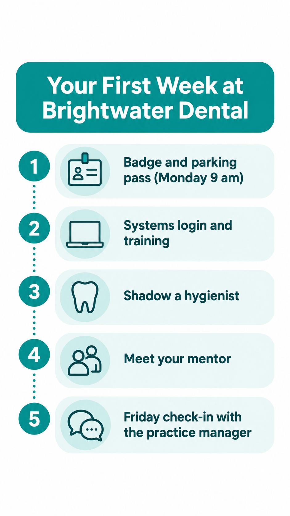
Process infographic, vertical. Title: 'Your First Week at Brightwater Dental'. Steps: 1 Badge and parking pass (Monday 9 am), 2 Systems login and training, 3 Shadow a hygienist, 4 Meet your mentor, 5 Friday check-in with the practice manager. Teal and white with simple line icons. Keep all wording exactly as written.
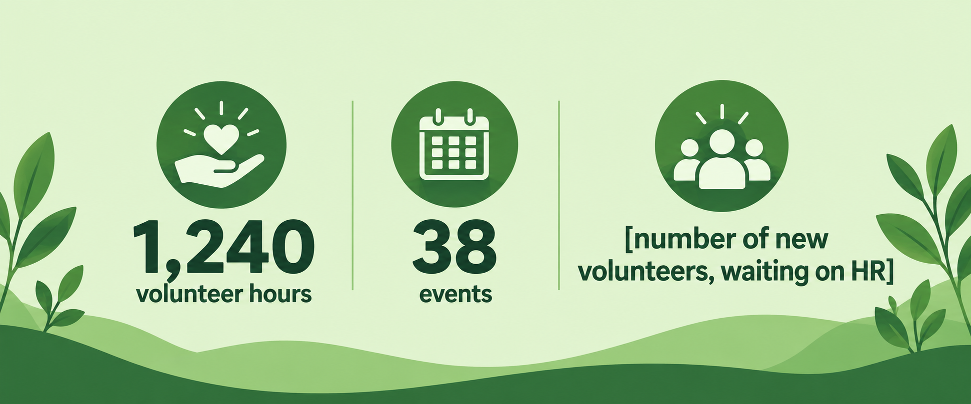
Statistics infographic for our 2025 volunteer program: 1,240 volunteer hours, 38 events, and [number of new volunteers, waiting on HR]. Horizontal, green palette.
Checks that the missing figure stays a visible placeholder or triggers a question, and that the two supplied numbers are reproduced exactly rather than rounded or restyled.