Explain what your SaaS product does and how its parts relate, in your own words, as one concept infographic for a landing page, a sales deck or an onboarding email.
One generated concept image with your product at the center and the parts you describe around it, joined only where you say they connect. It is a conceptual illustration, not an architecture diagram. Check every label and arrow caption.
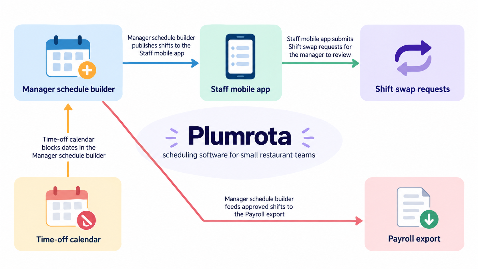
Manager schedule builder publishes shifts to the Staff mobile app
Staff mobile app submits Shift swap requests for the manager to review
Manager schedule builder feeds approved shifts to the Payroll export
Time-off calendar blocks dates in the Manager schedule builder
Six technical concepts, only two described links and no audience
Product name and one-line description
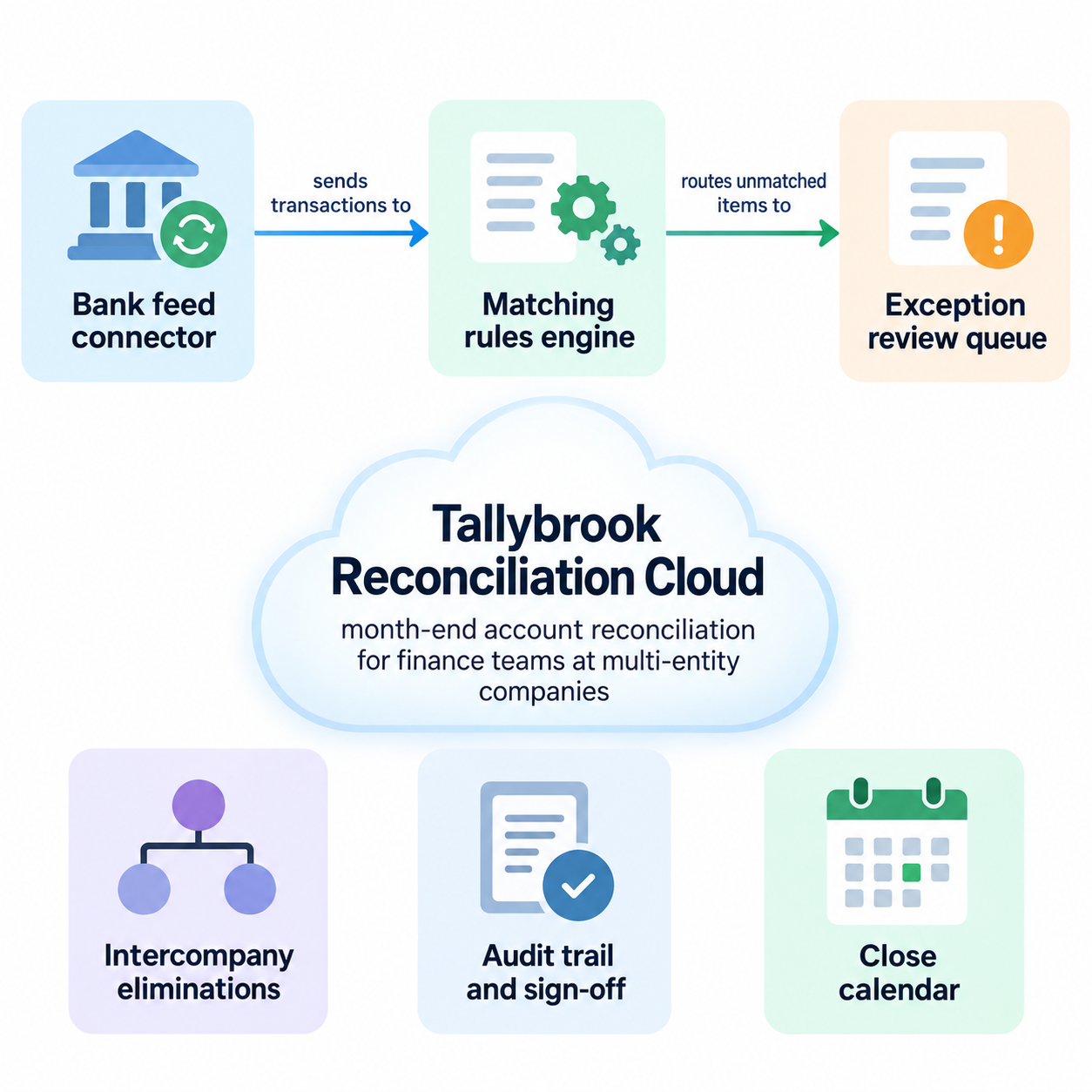
Tallybrook Reconciliation Cloud, month-end account reconciliation for finance teams at multi-entity companies
Concepts to show, one per line
Bank feed connector
Matching rules engine
Exception review queue
Intercompany eliminations
Audit trail and sign-off
Close calendar
How they connect, one link per line
Bank feed connector sends transactions to the Matching rules engine
Matching rules engine routes unmatched items to the Exception review queue
Audience (optional)
Left empty
Six technical concepts but only two described links, a long product line and no audience. Checks the three unlinked concepts appear without invented arrows, labels stay verbatim, and no vendor logos, security badges or architecture are added.
Same task, three directions
Pick a direction to start from.
01
Hub and spoke
The product sits in a central panel with the concepts around it and arrows only where you describe a link.
02
Layered cloud
A stylized cloud holds the product name, with the concepts stacked beneath it as layers.
03
Isometric workspace
Generic screens and devices in an isometric scene, each labeled with one of your concepts.
What the template keeps
The parts that stay consistent.
01
Product at the center
Everything is arranged around the product, so the image answers what it is first.
02
Links you describe, and no others
Arrows follow your relationship lines; nothing is connected by assumption.
03
Generic, brand-safe visuals
Screens, clouds and devices are generic, with no third-party logos or real interfaces.
How to use it
From details to a result.
01
Name the product
Its name and one line on what it does and for whom. This sits at the center.
02
List the concepts
Features, user groups or parts of the workflow, one per line and named the way your customers know them.
03
Describe how they connect
One link per line, using the exact concept names and a short verb phrase between them.
04
Review, generate and check
Vizify shows the full brief for review first. On the result, check each label and the direction of every arrow.
Output boundaries
What to check before you use it.
This is a concept illustration for marketing or onboarding, not an accurate system architecture or data-flow diagram. Use a structured diagram for that.
Labels and arrow captions are image text and may come back altered. Check each against your list.
Connections are drawn only where you describe them. Nothing about your stack, integrations or security is assumed.
Real third-party logos and interface screenshots are not reproduced; generic icons stand in for them.
Three to six concepts per image, one image per request. Wide and square set the framing only, not exact pixel sizes.
QuestionsCan a SaaS infographic show the apps we integrate with?+
Their names can appear as plain text if you list them as concepts. Logos are not reproduced, so check that your use of partner names follows their guidelines.
Can it show our pricing tiers?+
That is not what this template is for. Prices change and need exact text, so keep them on your pricing page. This image explains what the product does.
Is it suitable for a technical audience?+
It works as an overview for any audience, and you can keep technical concept names. For engineers who need the real architecture, a structured diagram is more accurate.
Can I use a screenshot of our product?+
This template draws generic screens instead of placing a screenshot, so nothing in your interface is misrepresented. Use your real screenshots alongside the image where detail matters.