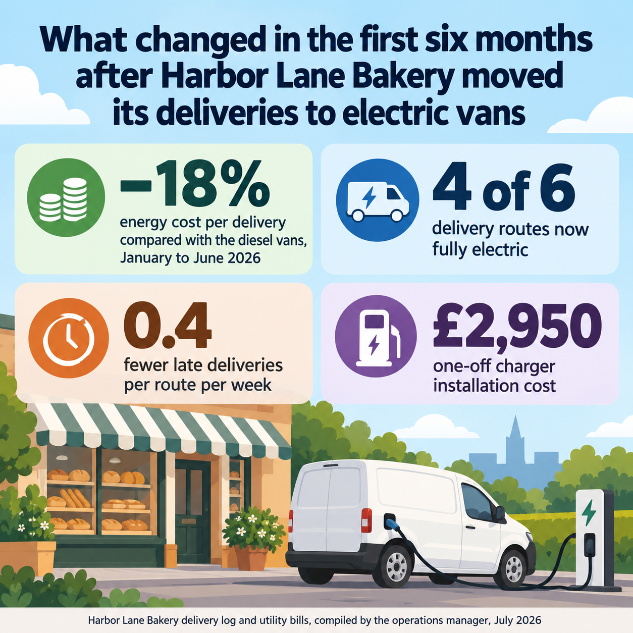
One generated image that leads with your headline takeaway and shows three to five of your statistics as large figures with labels, plus a source line. The numbers are drawn as text, not plotted. Check each value and unit before sharing.
Long headline, a minus sign, a currency and no context note
Headline takeaway
What changed in the first six months after Harbor Lane Bakery moved its deliveries to electric vans
Statistics with units and period, one per line
−18% energy cost per delivery compared with the diesel vans, January to June 2026
4 of 6 delivery routes now fully electric
0.4 fewer late deliveries per route per week
£2,950 one-off charger installation cost
Context note (optional)
Left empty
Source and date
Harbor Lane Bakery delivery log and utility bills, compiled by the operations manager, July 2026
Long labels with a minus sign, a pound sign, a fraction and a decimal, and the optional context left empty. Checks every value survives exactly, labels wrap without being reworded, and no trend arrows or extra comparisons appear.
Same task, three directions
Pick a direction to start from.
01
Big-number stack
Oversized figures stacked down the page, each with a one-line label. Suits a report cover or an intranet post.
02
Icon grid
A two-by-two grid where each statistic gets a cell with a simple icon, the figure and its label.
03
Presentation slide
A wide layout for dropping into a review deck, with the headline on the left and the figures in a row.
What the template keeps
The parts that stay consistent.
01
Takeaway before numbers
The headline sets up the figures so they read as a story rather than a list.
02
Figures as the largest elements
Each value dominates its label, so the eye goes to the numbers first.
03
Units stay with values
Percent signs, currencies and time periods sit next to the number they belong to.
How to use it
From details to a result.
01
Write the one takeaway
Decide the single point readers should leave with. It becomes the headline above the numbers.
02
Add three to five statistics
One per line, each with its unit and period. Copy them from your source rather than retyping from memory.
03
Name the source
Add where the figures come from and when they were pulled, so readers can judge them.
04
Generate, then check every figure
Review the brief in Vizify and send it. On the result, compare each digit, sign and unit with your source.
Output boundaries
What to check before you use it.
The image model draws digits and symbols, so a value, decimal point or unit can change. Compare every number with your source before publishing.
Figures are shown as text, not plotted. Any shapes in the design do not represent exact proportions; for exactly plotted data use one of Vizify's chart tools.
Three to five statistics per image. More than that, or a full dataset, should be split across images or turned into a chart.
The template does not research, calculate or benchmark anything. It shows only the statistics and source you supply.
Each request makes one image, and formats are aspect-ratio directions rather than exact sizes.
QuestionsCan I paste a whole spreadsheet into a statistics infographic?+
Pick the three to five figures that carry your point and paste those. A full table belongs in a chart or a report, where every value can be plotted and checked.
Will the bars in my stats infographic be accurate?+
This template avoids plotted bars on purpose. Figures appear as typed values, because an image model cannot guarantee exact proportions. Use a chart tool when the visual itself has to be accurate.
Where do the infographic statistics come from?+
Only from you. Nothing is looked up or estimated. Add the source and date so readers know where each number came from.
Can statistical infographics compare this year with last year?+
Yes, if you supply both values and write the comparison yourself, such as "up from 1,900 in 2025". The template never calculates a change on its own.