Summarize three to five survey questions and their percentages, with the number of responses and survey dates shown, as one infographic for members, staff or a newsletter.
One generated summary image with your survey name, the number of responses and dates, and three to five questions with the percentages you supply. Percentages are shown as figures, not plotted. Check every value, and keep results describing respondents only.
Neighborhood survey with four questions and a method note
Survey name and who ran it
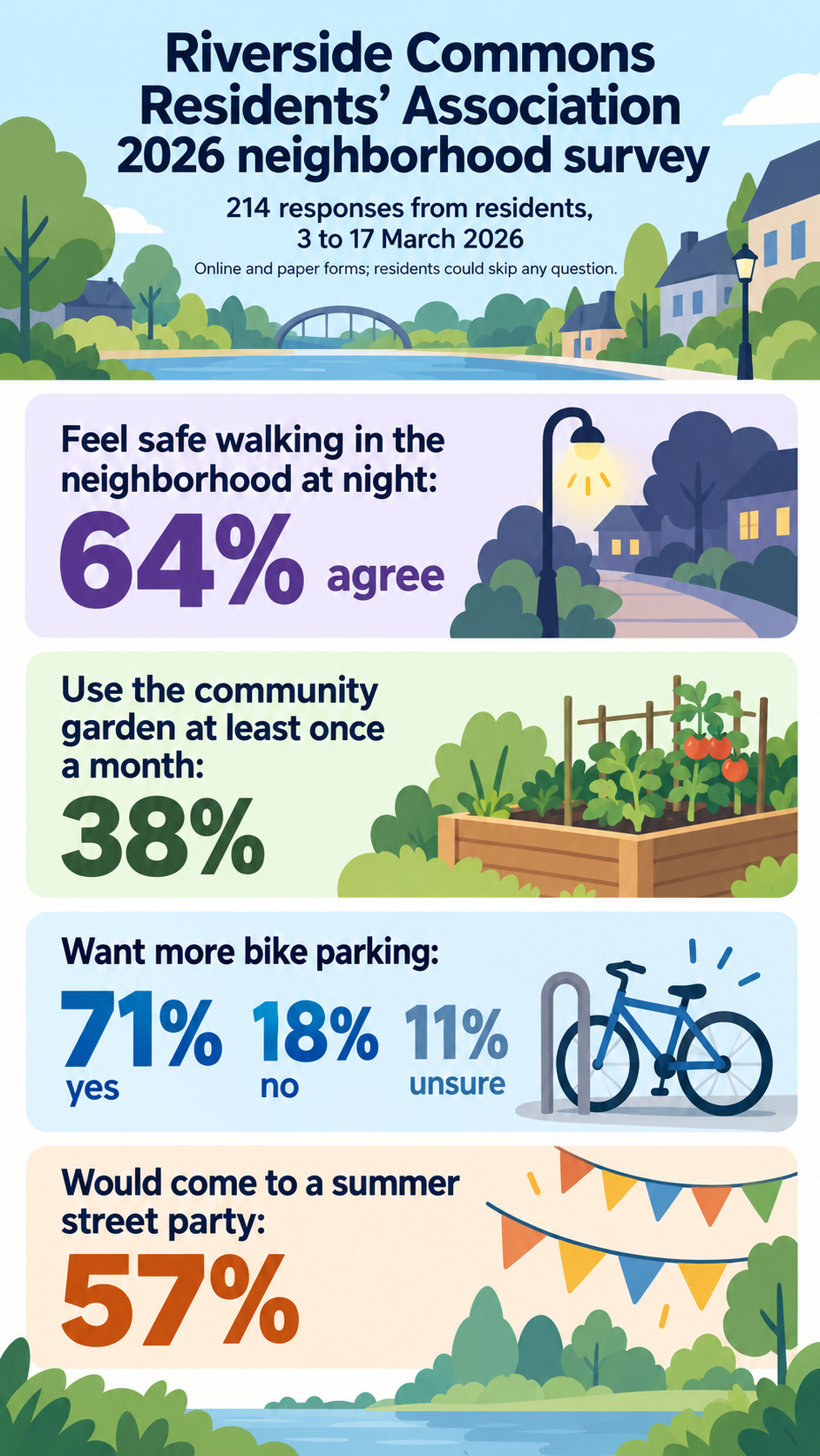
Riverside Commons Residents' Association 2026 neighborhood survey
Number of responses and survey dates
214 responses from residents, 3 to 17 March 2026
Questions and percentages, one per line
Feel safe walking in the neighborhood at night: 64% agree
Use the community garden at least once a month: 38%
Want more bike parking: 71% yes, 18% no, 11% unsure
Would come to a summer street party: 57%
Method note (optional)
Online and paper forms; residents could skip any question
Staff pulse survey with a multi-select question and an unreported remainder
Survey name and who ran it
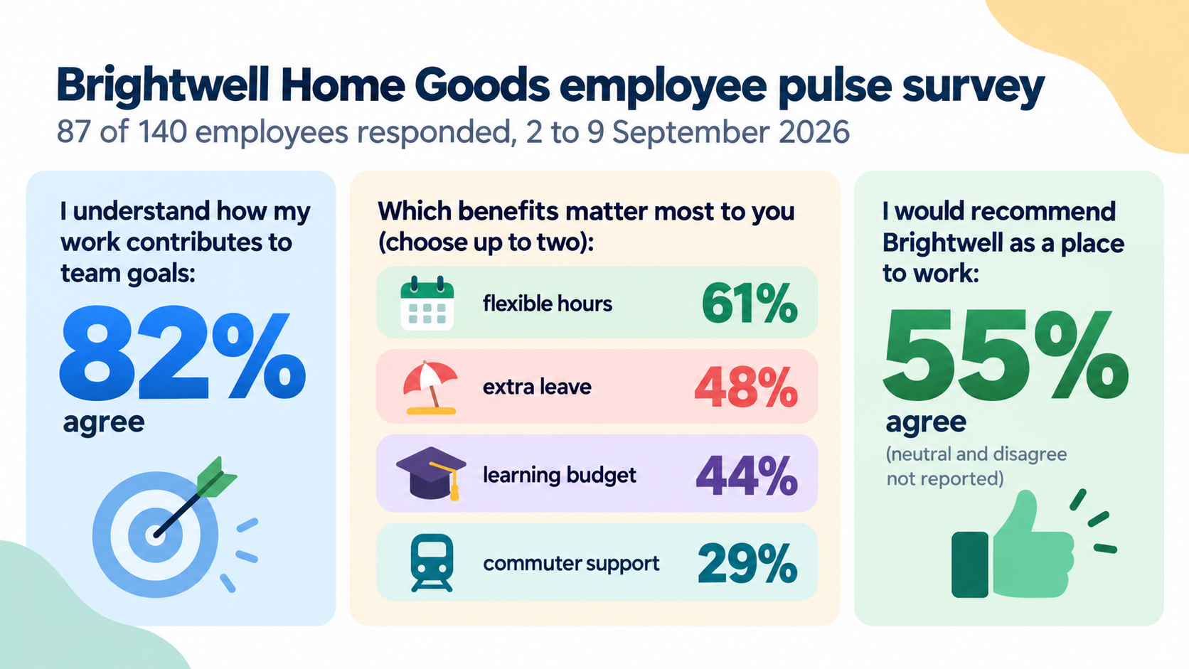
Brightwell Home Goods employee pulse survey, customer care and warehouse teams
Number of responses and survey dates
87 of 140 employees responded, 2 to 9 September 2026
Questions and percentages, one per line
I understand how my work contributes to team goals: 82% agree
Which benefits matter most to you (choose up to two): flexible hours 61%, extra leave 48%, learning budget 44%, commuter support 29%
I would recommend Brightwell as a place to work: 55% agree (neutral and disagree not reported)
Method note (optional)
Left empty
A multi-select question whose shares add up to more than 100 percent, a question with the remainder unreported, and a sample line that invites a response-rate calculation. Checks no totals, remainders or response rate are added and results read as respondents' views.
Same task, three directions
Pick a direction to start from.
01
Big-percentage cards
Stacked cards with each question in medium type and its percentage very large.
02
Newsletter banner
A wide summary with the survey name on the left and three or four results in a row, for an email newsletter or report cover.
03
Notice board
Each result pinned to an illustrated notice board as a paper note, for a community hall or members' post.
What the template keeps
The parts that stay consistent.
01
Respondents, not everyone
The respondent line and wording keep it clear that results describe the people who answered.
02
Figures as supplied
Percentages appear exactly as entered, with nothing rounded, completed or recalculated.
03
One question, one result
Each question keeps its own space so results are not mixed up.
How to use it
From details to a result.
01
Name the survey
Who ran it and what it was about. This becomes the heading.
02
Add the responses and dates
How many people answered and when the survey was open. It tells readers how far the results reach.
03
List questions with percentages
One question per line with its percentages exactly as your survey tool reports them.
04
Review, generate and check
Nothing runs until you send the brief from Vizify. Compare every percentage on the result with your survey export.
Output boundaries
What to check before you use it.
Percentages, response counts and dates are image text and can come back altered. Check every figure against your survey export.
Figures are displayed, not plotted. For bars or pies with exact proportions, or a full breakdown, use a chart tool with your data.
Results describe the people who responded. No margin of error, significance or claim about everyone in the group is added.
Missing answers stay missing. No remainder, response rate or total is calculated for you.
Three to five questions per image. Split a larger survey across several images.
QuestionsWhy does the survey infographic show the number of responses?+
A percentage means little without knowing how many people answered and when. The respondent line gives readers that context and keeps the results tied to your sample.
My percentages don't add up to 100. Will they be corrected?+
No. Multi-select questions, skipped answers and rounding often produce totals above or below 100. Your figures are kept as entered, and the reply points out any question that doesn't total 100.
Can I show infographic survey results as bar charts?+
Not exactly in this template, because an image model cannot guarantee bar lengths. For plotted results, use a chart tool with your data and keep this image for the headline summary.
Can survey infographics include comments from respondents?+
Yes, one or two short quotes in the additional direction, used with permission and without names. Keep them short so they render cleanly.