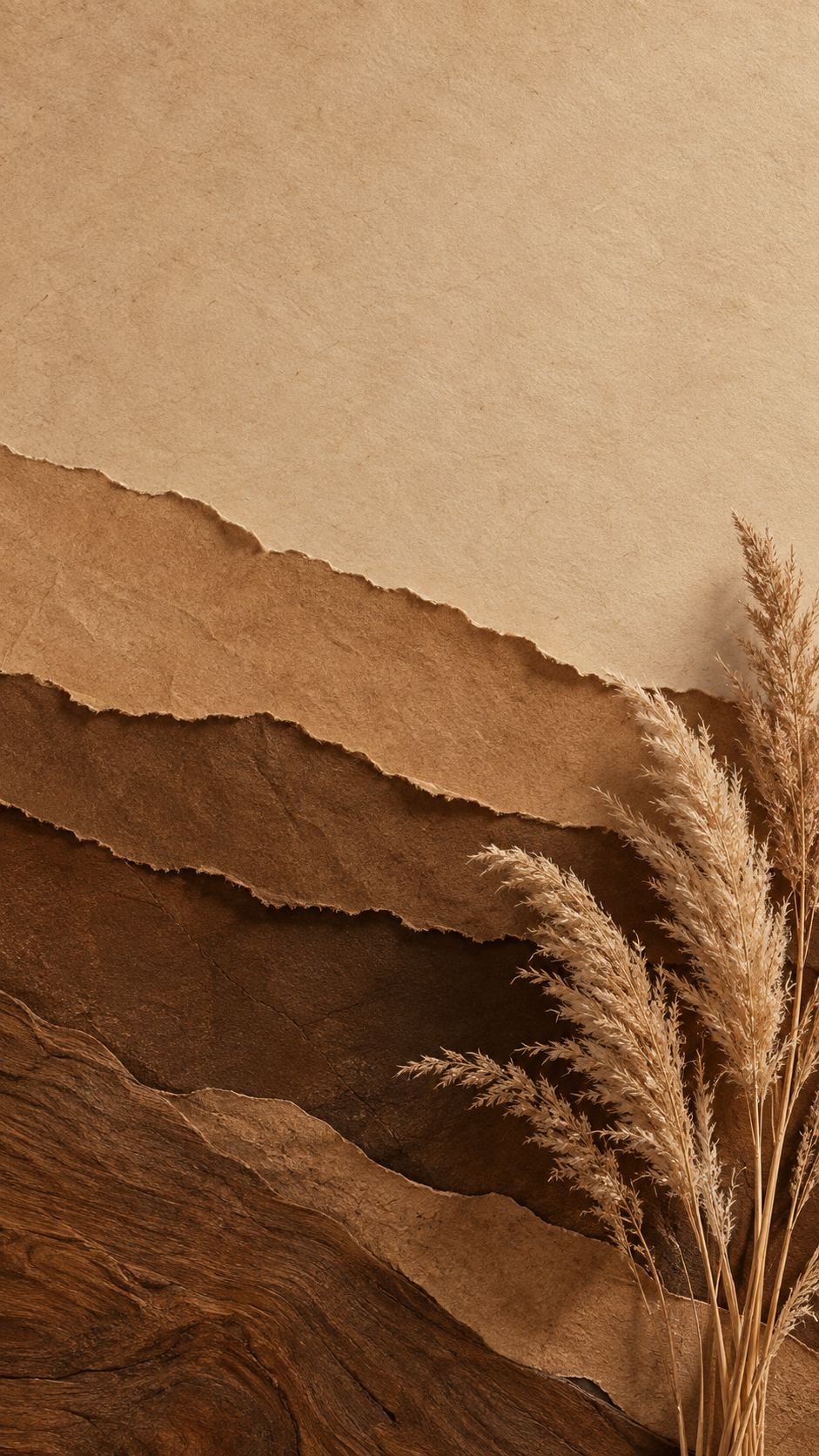
Brown aesthetic wallpaper in paper and natural textures.
Create a brown wallpaper from the tones you choose, from cream to espresso, with textures like kraft paper, linen, wood grain or dried leaves, for a phone or desktop.
One generated wallpaper in your range of browns, built from light and dark tones and a natural material, with calm areas for the clock or desktop icons. No text, labels or brand marks.
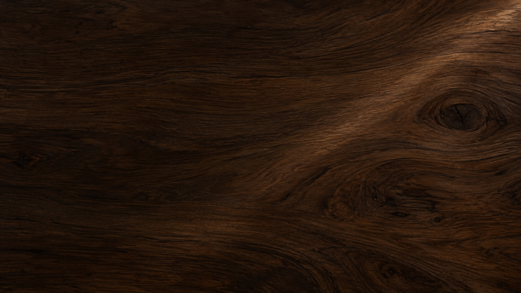
Near-black espresso wood grain for dark mode, no element
Brown palette
Only very dark browns, from espresso to almost black, for a dark mode desktop
Texture or material (optional)
Walnut wood grain with visible knots and a faint diagonal light streak
One natural element (optional)
Left empty
A near-black brown range and a strong wood grain for dark mode, with no element. Checks that the tones stay recognizably brown rather than black, the grain stays subtle behind icons, and nothing is added.
Same task, three directions
Pick a direction to start from.
01
Layered paper
Torn kraft and cream paper layers with soft shadows, warm and handmade.
02
Linen with dried stems
A neutral linen surface with a few dried stems in one corner, for a quiet, natural look.
03
Suede gradient
A smooth brown gradient with a soft suede-like surface, the calmest choice for a busy desktop.
What the template keeps
The parts that stay consistent.
01
One color family
Browns only, varied by lightness and material rather than extra colors.
02
Tactile, natural surfaces
Soft light and real-looking materials give the wallpaper warmth.
How to use it
From details to a result.
01
Pick your browns
Name three to five tones from light to dark, such as cream, caramel and espresso.
02
Choose a material
Paper, linen, suede, wood, stone or clay. The material gives the wallpaper its character.
03
Add one element, or none
Dried stems, leaves or coffee beans, placed away from the clock or icons.
04
Pick phone or desktop
Portrait for a phone, landscape for a desktop. The calm areas move with the format.
Output boundaries
What to check before you use it.
Made in a 9:16 or 16:9 direction, not your screen's exact resolution. Edges may be cropped.
Colors vary between screens, so a brown that looks warm on one display may look cooler on another.
Materials are generated and may not match a specific real paper, wood or fabric.
Phone and desktop versions are separate requests and may differ in small details.
QuestionsCan I get a brown aesthetic wallpaper for desktop and phone in the same style?+
Yes, with two requests. Keep the palette and material the same, choose landscape for the desktop and portrait for the phone, and each is framed for its screen.
Will icons be readable on a brown desktop wallpaper?+
The icon side is kept calm and even in tone. On very dark browns, ask for the icon side to be a little lighter if labels are hard to read.
Can it include coffee or books?+
Add one element, such as a scatter of coffee beans or a stack of plain books. Cups carry no labels and books have no readable titles, to keep the wallpaper free of text and brand marks.
How many shades of brown should I use?+
Three to five tones from light to dark give enough depth without looking muddy. Name them plainly, such as sand, caramel, cocoa and espresso.